


Investment Advisor Dashboard & Client View
An investment dashboard for advisors to monitor individual client accounts and their overall business.
Overview
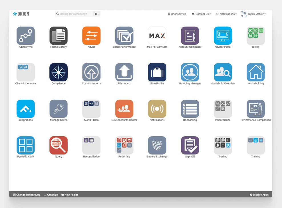
Orion’s platform suffered from data fragmentation across multiple apps, making it frustrating for users to find and act on necessary information. Apps were siloed by function, ignoring cross-functional workflows, and users were overwhelmed by the number of available apps.
The challenge
Crunched on time? This is the TL;DR section
Orion's primary purpose is the aggregation, presentation and distribution of financial information. The proliferation of apps had caused a deep fragmentation of this data across the platform and made it frustrating for users to find and act on the information they needed.
Apps were siloed by function and ignored the cross functional nature of users’ workflows. To complete a single task it wasn't uncommon to have to jump between 2 or 3 apps.
Users were intimidated by the sheer number of apps available. It left them feeling overwhelmed and less likely to explore and use tools they could potentially benefit from.
Users had to actively monitor and audit data, an error prone process, since it required constant oversight
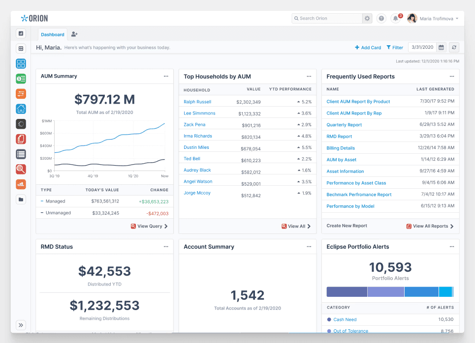
The left image is what the Orion home page looked like before and the right was the redesign—a flexible solution that accommodates the needs of different businesses and roles within the financial advisory world.
My role
I was the lead designer and researcher on this project, alongside a scrum team of 4 full-stack engineers, a PM, and a another designer supporting with crafting dashboard card content. Work that I owned or was directly responsible for:
Conducted user research through interviews, surveys, and analytics
Identified two primary user archetypes: data consumers and data managers
Developed design mandates based on research findings
Iterated through numerous concepts and wireframes, conducting concept testing with research participants
Created a flexible dashboard system that can be customized per advisor, firm, or role
Designed a client view accessible from the home screen for accessing client view quickly (think customer calls around investment data)
Facilitated a 6-month beta testing period
Implemented an in-app onboarding experience and feedback mechanism through Gainsight
The process
Because the focus of this project was the home page — and so the face of our platform — it was an opportunity to ask some fundamental questions about our product. Who was it for? What problems was it attempting to solve for them? How effective was it at solving them? Had we even identified the correct problems?
We would answer these questions and learn about our users through a few different methods: user interviews, surveys, and analytics. This would be the first user-research led project in Orion's 20+ year history. My team and I advocated for, planned and led the research and analysis for this project.
Research & Analysis
With the help of product managers and a group of strategic consultants, both groups that work closely with our users, we:
Recruited and interviewed a group of 20 participants that represented different types of financial businesses and roles.
Surveyed 100+ users
Ran analytics to understand the behavior of thousands more.
We utilized the strengths of each methodology to give us unique insights on the questions we had. For example, one of our research goals was to understand the common scope of responsibility. In other words, how much of Orion did any one person have to know and use? Was it common for one person to cover reporting, trading and billing? Or was the scope typically more limited? Where there any patterns in which areas of responsibility fell to which roles?
Analytics helped show us where users were spending the most time. It quickly became clear that usage of our platform closely followed the Pareto rule — with a large majority using a small share of our products. Outside of a half-dozen heavily used apps, there was a sharp drop-off in usage. This was true in aggregate and at the individual user level. This was reaffirmed in our surveys and we learned even more through our interviews...
Personas
As we spoke with users, it became clear there were two dominant user archetypes. There were those that primarily used Orion to consume information and a separate group that worked to manage that data and ensure its accuracy.
These behaviors generally correlated to roles within a firm. Financial advisors were typically consumers of data. They didn't spend much time in Orion and most of the time they did spend was client driven. Meaning they used Orion when a client would call in with a question or during a client meeting to review their portfolio.
People in operation roles were the managers of data. They were responsible for ensuring the data was there and accurate so that when the advisor was in those client interactions, they could avoid embarrassing situations like account values not matching a client's records or expectations. Being precise and detail oriented is important when you're asking people to trust you with their money.

Design Mandates
Once we had gathered the results of our research, I led an analysis session with our design team, where we used affinity diagramming to identify key behavior patterns and pain points. We came away with the following design mandates:
People should not have to seek out what needs their attention
Information should move fluidly through the platform and not siloed within apps
It should be easier for people to monitor and manage data for accuracy
Clients are central to a lot of our users day-to-day workflows, our platform should reflect this importance
Not everyone cares about the same things, our system should flex to accommodate different priorities
Our guiding problem statement
How might we make it more efficient for users to find and take action on the information that is most relevant to their role in supporting the business of a financial advisory firm?
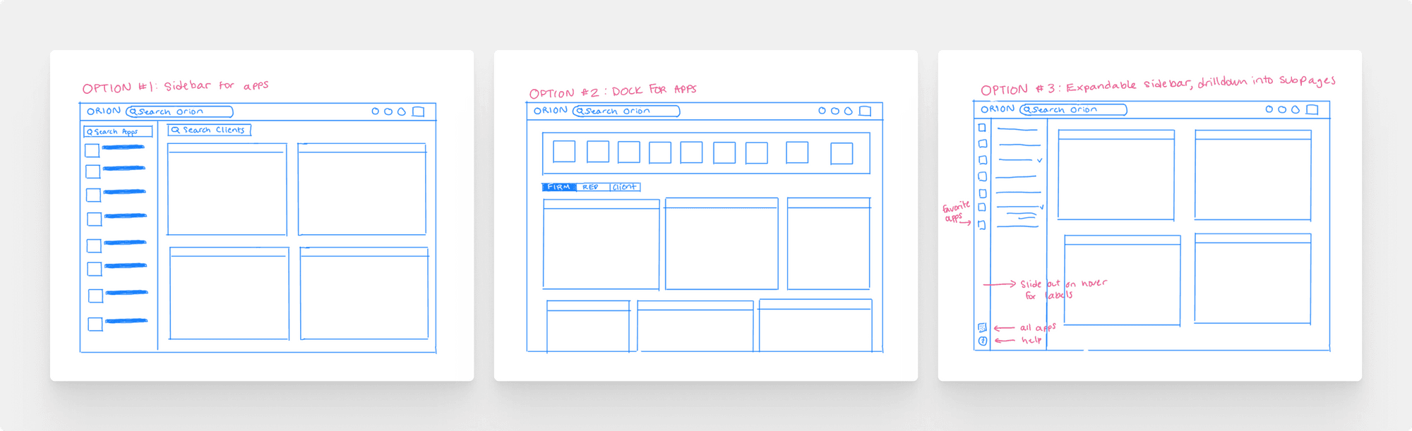
Some initial layout concepts—surfacing commonly used applications and relevant information to the user.
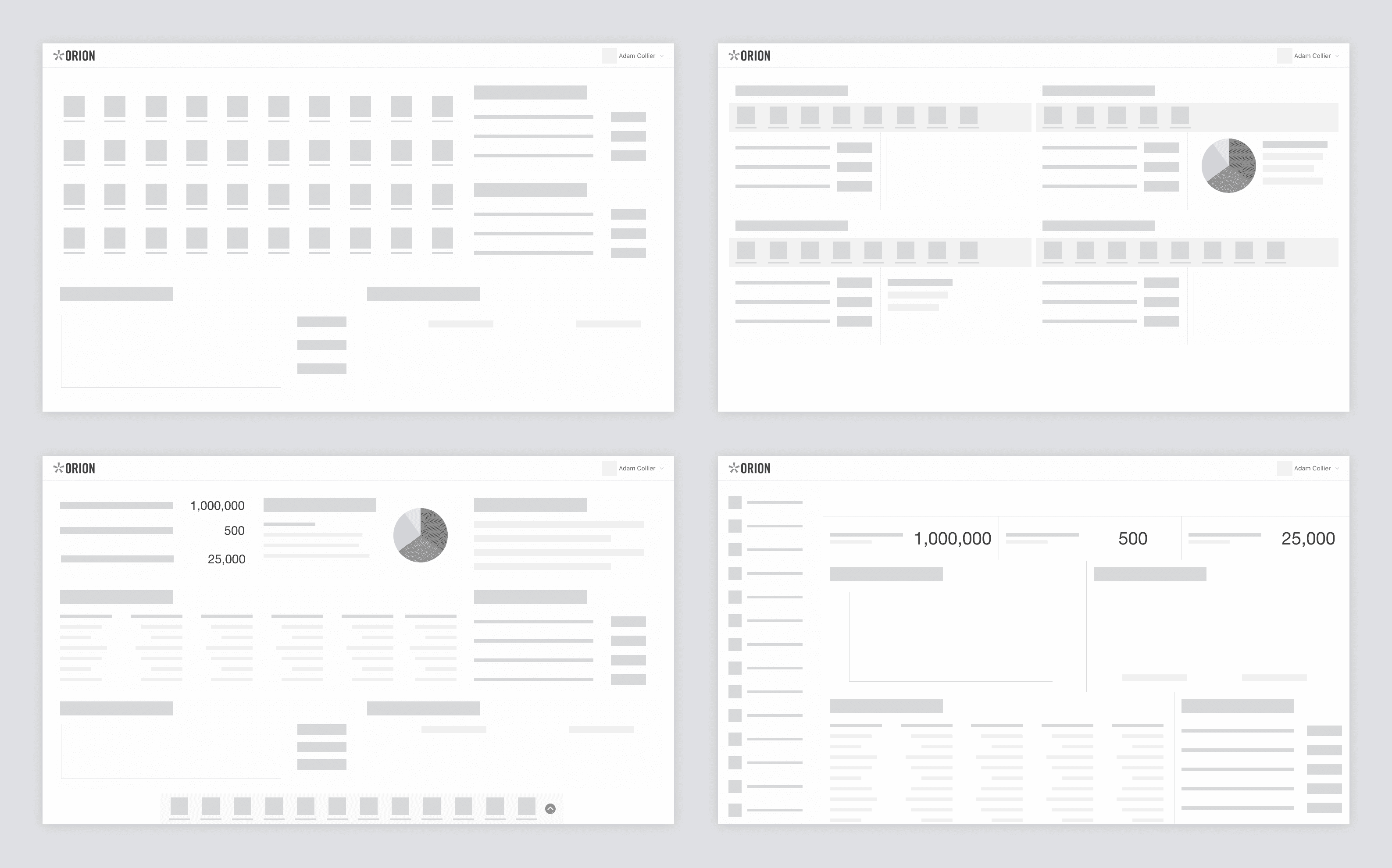
Making wireframes in Figma to get a better sense of the different layouts

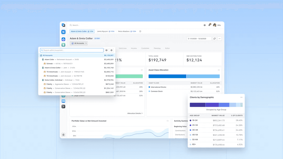
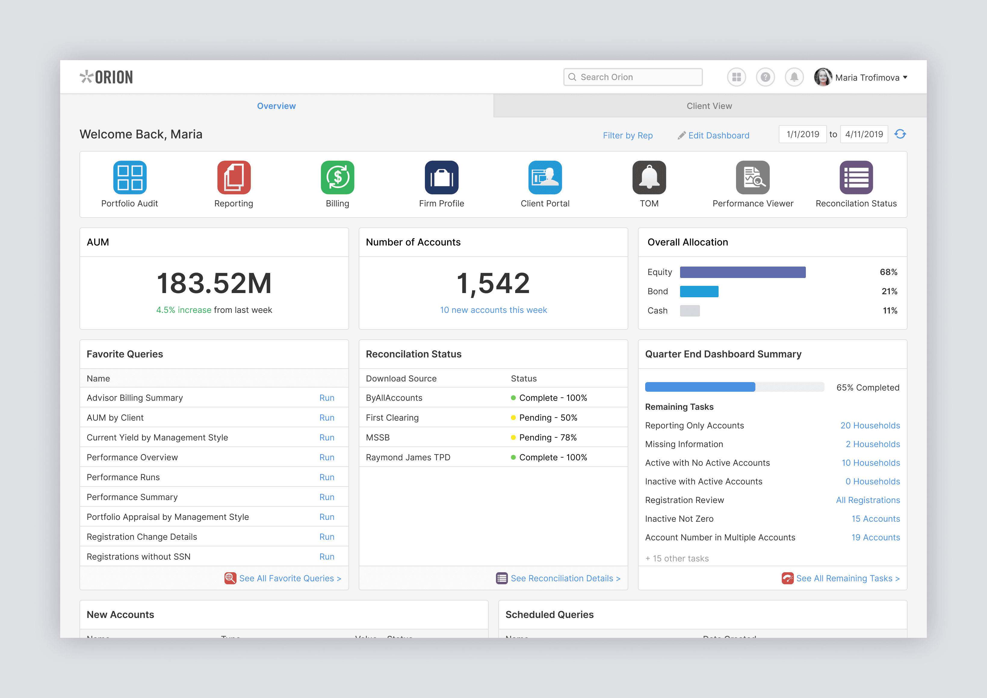
What if you could access and manage all of your client's information from the home screen? No need to remember which app has what data, no jumping between different apps. One place, one click away, right from the home page.
Users cared about different things and we needed a flexible system to allow them to shape their experience.
Solution
The final solution coalesced into a home page that is customizable at the firm, role or individual level. Advisors can keep an eye on the things that matter most to them and quickly jump in and take action if needed or rest easy knowing it's all good!

Users can keep an eye on the things that matter most to them and quickly jump in and take action if needed or rest easy knowing it's all good!

Clicking the icon next to the dashboard tab in the tab bar allows the user to quickly open a client to check on their portfolio, and then right back to their dashboard if they need to. A listing of the client's accounts are easily selected in the sidebar panel on the left.
Results & Impact
I revealed this project to the industry at the 2020 T3 FinTech conference in San Diego. I had advisors flooding to Orion's booth shortly after—this project was something that differentiated Orion from competitors in this space. It was rewarding to know that this was a result of discovery research and design strategy.
After conducting a 6-month beta testing period, Orion released their new dashboard experience on August of 2020 as the primary landing page for all users. This was the largest UX enhancement to the Orion platform since it released it's web-app in 2012.
Our new experience increased our overall Product NPS by 16 points in the span of 3 months. While this positive reaction was rewarding, I made a particular effort to reach out to users that struggled with the new experience in an attempt to see what we may have missed amongst our initial assumptions or if there were opportunities for more improvement.
A few items that were a result of the 6-month beta testing:
I created an in-app onboarding experience to help walk new users through the interface and help them feel comfortable with the new setup
I worked with my PM to place a modal within the app that allowed users to provide feedback on the experience
I tagged the product with our product analytics tool to calculate things like time-on-task, adoption, and retention rate with particular features
Reflections
There are many more personas with many different responsibilities and needs that should have considered with a project of this scale
The users in our space of technology have a high resistance to change and change should be thoroughly communicated through onboarding, being more transparent about beta opportunities, and a better feedback loop that's integrated into the product itself
We made a big change to how users leverage Orion and navigate the site—from the minute they login. I wish we would have spent more dev focus and design QA testing in making sure the sidebar navigation was battle-tested for production.
This project spanned the entire platform of 30+ different applications that served different purposes. It was challenging to get stakeholders to align on MVP, which made it hard to manage expectations upon delivery
There are likely many more areas where we've likely gotten things wrong, but through this process Orion has established a solid foundation upon which to iterate, build and grow.
Read more about the reimagined Orion experience.
Other great designers that worked on this project
Paymon Nanji Paymon led the research of the Portfolio View and we collaborated together through different iterations of the design. He contributed to user research, analysis, interface design, prototyping and usability testing. LinkedIn
Bre Marshall Bre provided support for all areas of the project from user research to prototyping. Her main focus was on designing the cards that would be the backbone of the dashboard experience. She worked tirelessly through countless iterations to nail this critical piece of the project. LinkedIn